

Exactly one year ago, my parents, me, and about 38 of our family friends began our trek up to the summit of Mount Fuji. It was a trip envisioned by my mom about a year and a half prior— we were looking through old family photos with my grandparents, and found a photo of my grandparents, 2 of my uncles, and several of my Japanese relatives on the 8th Station of Mount Fuji from 1964. Realizing she’d never been on the mountain herself, she and some of our family friends began planning and training for the most memorable hike of our lives.

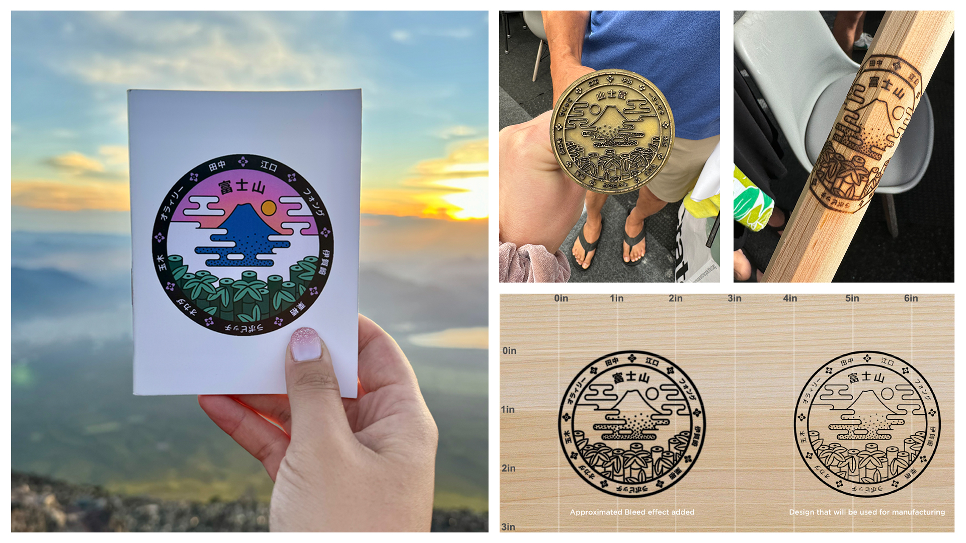
Ahead of the trip, my uncle commissioned me to design a logo to represent our crew. He didn’t give any particular direction, but luckily, I knew exactly where I wanted to take this. I immediately knew that I wanted to design a seal— a self-contained symbol that could work as a stamp. Content-wise I wanted to incorporate Mt. Fuji (obviously), but maybe from a perspective that shows it above the foliage and clouds to tie it to our hike. Another idea I knew I wanted to incorporate was the names of all the families. There were nine families total, and I had the names along the border of the circle in Japanese.
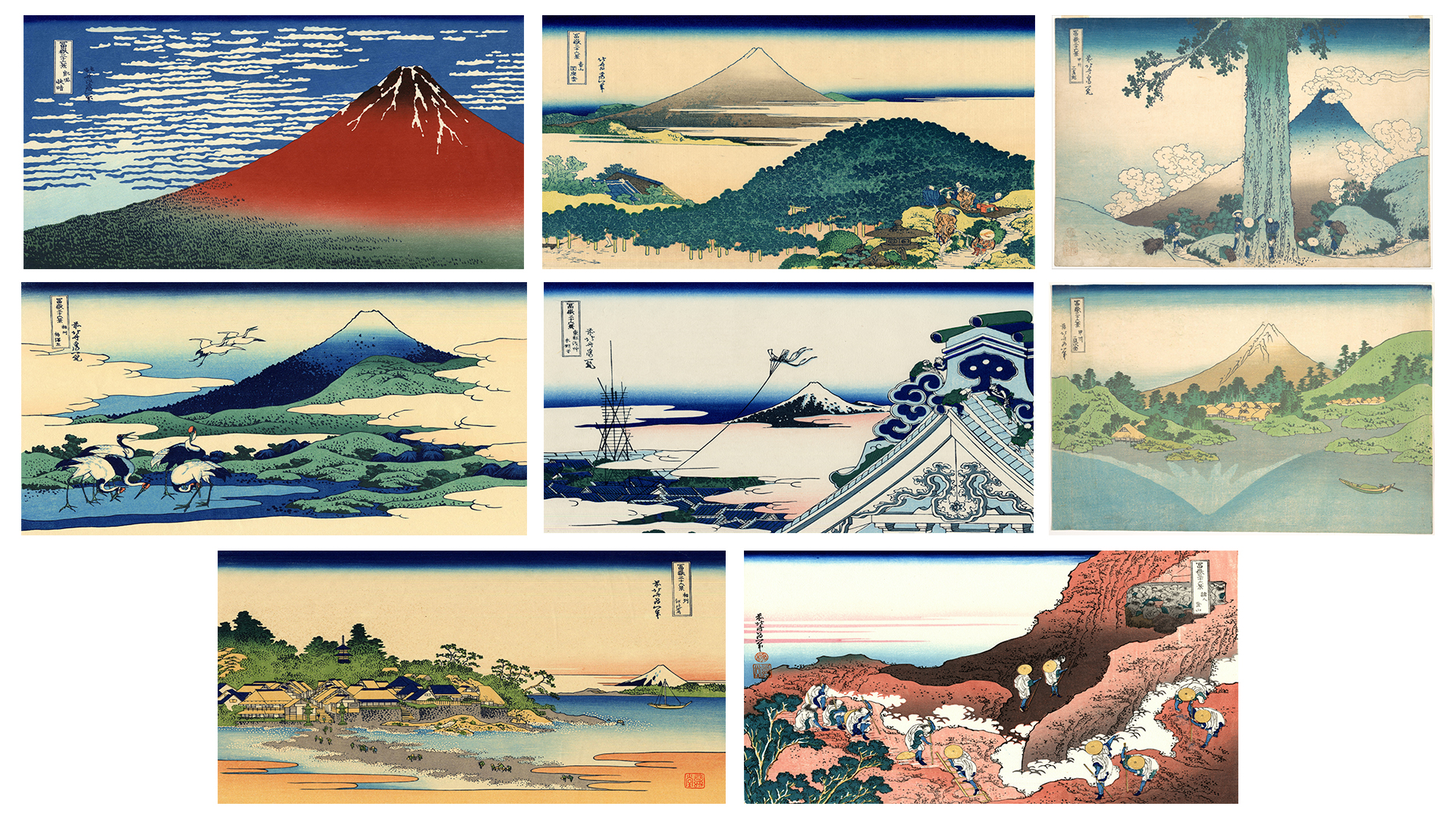
Through visual research I started with Hokusai’s famous 36 Views of Mt. Fuji to gather a bunch of different compositions of the mountain. Everyone knows The Great Wave, but the whole series has such great variety in depictions of the elements, especially the clouds. (Fun fact: the original 36 Views series was so popular that Hokusai was commissioned to do 10 additional views. The last image above is from those 10 additional pieces, and it is the only one that actually depicts hikers on the mountain. It was fun thinking about this piece in anticipation of our own hike!)
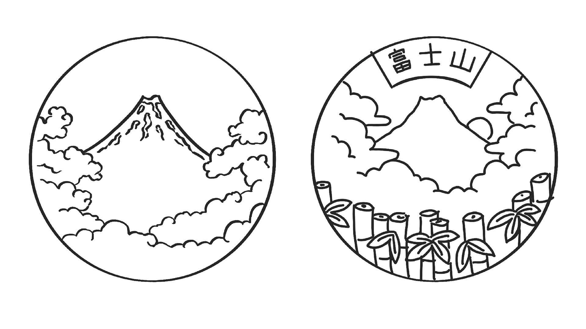
My initial studies.
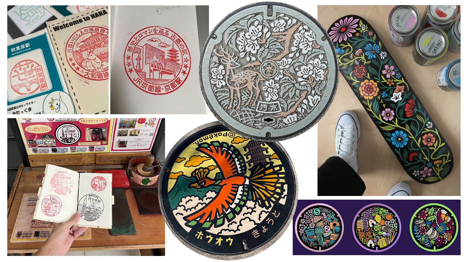
The 36 views were a good starting point, but I felt like my initial passes weren't quite the feel I was looking for. So I also ended up drawing heavily from two other Japanese fixtures. One was eki or train station stamps, which I was already thinking about when I first started the project. The second was the intricately designed utility covers that serve as identifiers for different neighborhoods or cities in Japan. These would work perfectly with the circle seal concept and provide a shorthand to make it feel more Japanese. Finally, I looked to the work of Dana Tanamachi, who has inspired me for over a decade with her detailed, contemporary interpretations of Japanese style design. In fact, I learned that she had designed a few manhole cover-inspired pieces herself (bottom right images on the moodboard)!
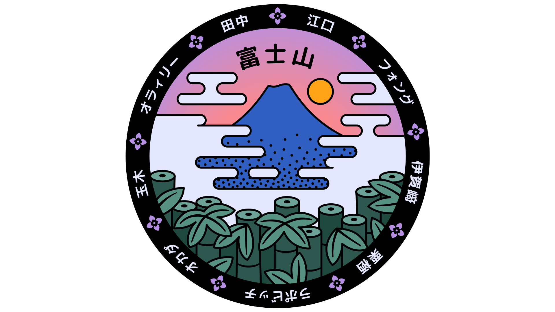
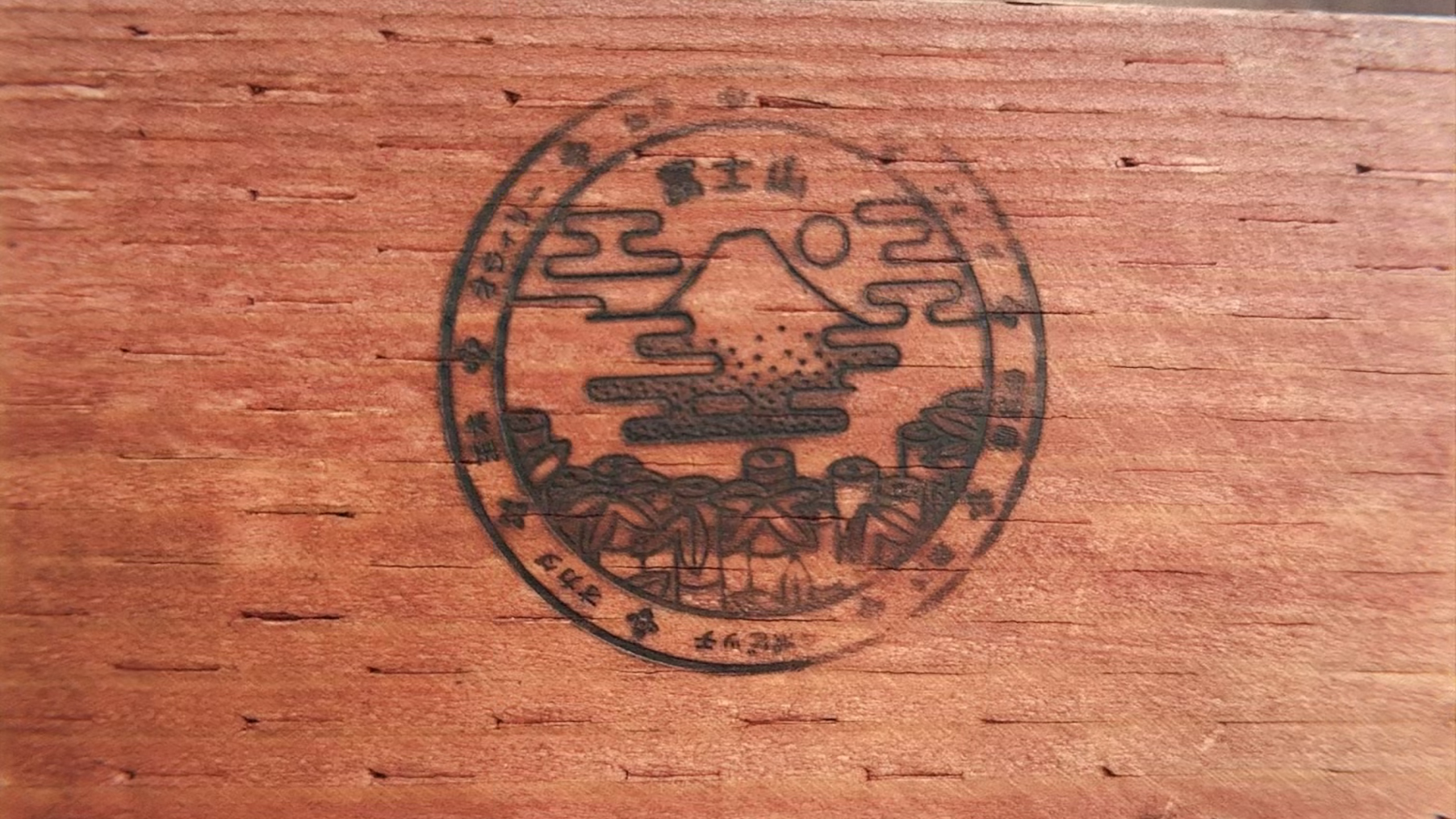
After cracking the style, I landed on the above as the final mark! The kanji in the center says "Fuji-san," and the names along the edge are the 9 family names from the trip (ours, Lapovich or ラッポビッチ, is at 6 o'clock). After sending it off, my uncle had the seal made into a few different items. For the trip, he ordered stamp books and luggage tags. After we got home, my uncle found a place that could turn the seal into a wood burn stamp, and it was incredibly lucky that the seal translated so well for that purpose! We had a reunion party for the trip the following month where we all got to brand our hiking sticks with the trip logo, making it extra personal.
It was lovely to have the opportunity to connect to my Japanese heritage not only through literally walking the same path as my family did 60 years earlier, but also through this design exercise that allowed me to play with cultural elements and language.


No comments.